
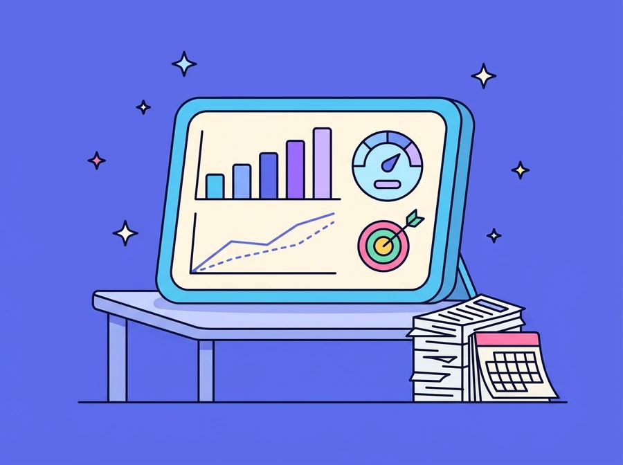
Most sales reports describe what has already happened, and by the time the numbers arrive it is too late to act on them. This system puts the daily forecast calculated by an AI/ML model alongside actual sales on the same chart, so the gap between plan and result appears every day instead of at month-end close, and can be drilled into down to product, category, region, channel and individual customer. ThinkVerse AI built it as an AI Sales Dashboard.
Built for
Executives and sales teams who need to know by mid-month whether the target will be met, and production teams that have to plan capacity ahead
Forecast and actuals on the same chart
The system shows the daily sales forecast directly against that day's actual sales, so the error is visible straight away instead of being absorbed into the month-end total. The point is not to show off the model's accuracy but to reduce the amount of estimating done on gut feel, and to give production and dispatch a forward number for planning capacity and delivery runs. Alongside it sits a cumulative month-to-date view against the forecast, which answers whether the month as a whole is running ahead of plan or behind it.
- Daily AI/ML forecast against actual sales
- Less estimating on gut feel
- Used to plan production and delivery ahead
- Month-to-date sales tracked against the forecast
One set of data, many views
The same set of data can be looked at from several angles without commissioning a new report. Filter by product, product category, region, channel and customer, then switch between daily, monthly and historical views on the same screen. Every view compares three ways at once: against target, against last year, and against the forecast. A question such as which channel is missing target, and since when, can therefore be answered from the screen within a single meeting.
Metrics that show where the gap comes from
The tracking section summarises growth against the previous year, progress against target and the gap still to close, across every dimension of the data, and drills down to region, customer or product level to pin down where the difference between plan and actual is coming from. Beyond sales, a customer-analysis screen tracks customer numbers and churn rate, broken out by age group and balance band, so the revenue coming in and the customer base draining away are visible at the same time, two sides usually looked at in separate reports.
- Growth against last year, progress to target and the remaining gap
- Drill-down to region, customer and product level
- Analysis of the variance between plan and actual
- Customer numbers and churn rate tracked by segment